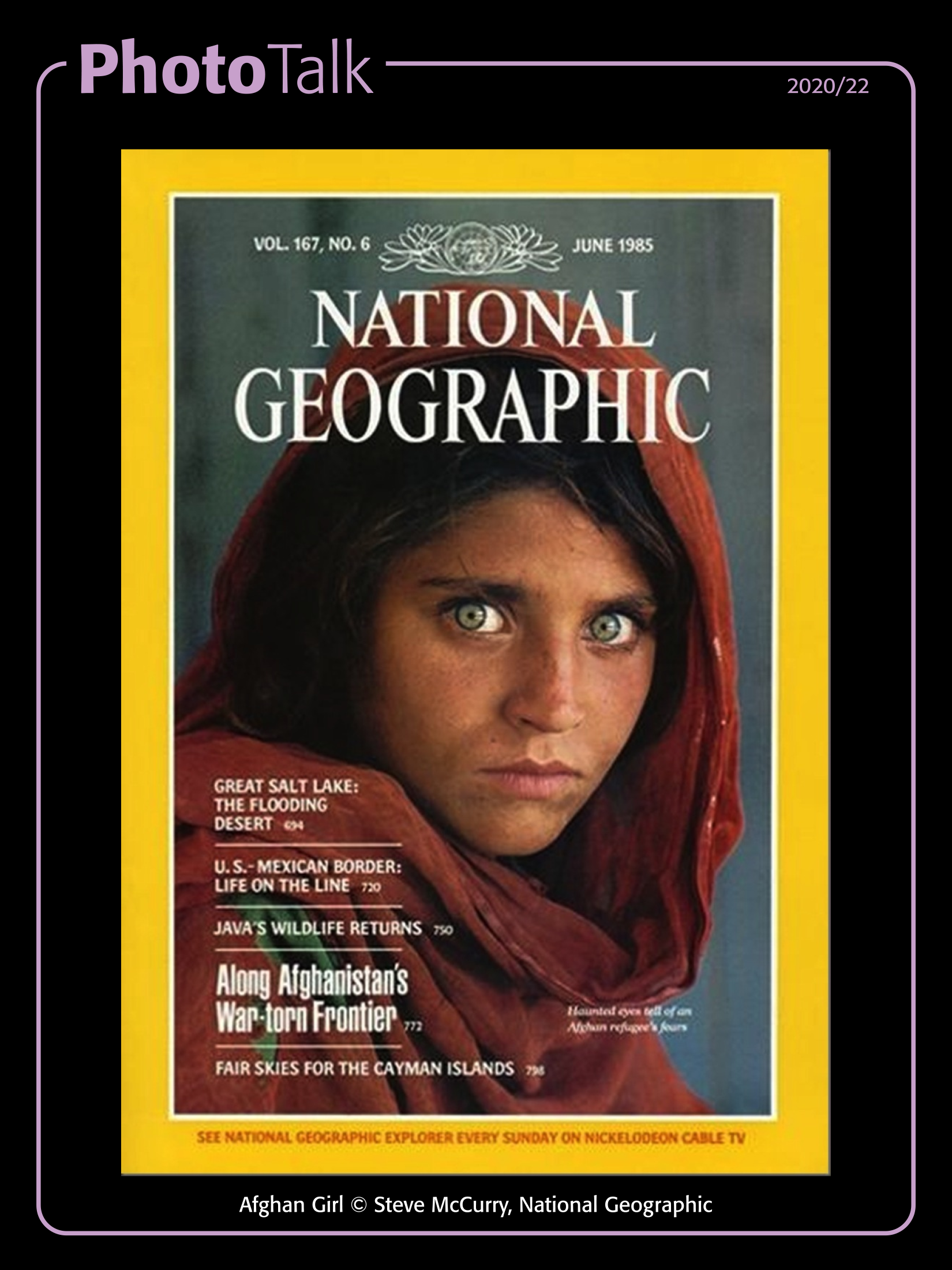
Afghan Girl

PhotoTalk 2020/22

In June 1985 Steve McCurry’s photograph (since called Afghan Girl) was printed on the cover of the National Geographic magazine, anyone looking at the magazine was immediately struck by the intent look of an adolescent girl staring intently out from the magazine.

2020-22.cdr

It is such an iconic image that it has been named “the most recognized photograph” in the history of the magazine.  It portrayed an adolescent Sharbat Gula (or Sharbat Bibi) in a red head scarf, with her striking green eyes staring intently at the camera.  McCurry’s use of Kodachrome film was widely known, and the colours he achieved were brilliant, needless to say he used his tools to advantage.

The context in which the image was published likely aided the readers, but the image itself stands alone.  It has been widely discussed, widely reprinted, and widely reproduced on the internet as well.  McCurry has lost some standing worldwide due to a few scandals involving some of his photographs and “editing”, but the impact of the Afghan Girl image is undeniable.

Fame or infamy, Photo-Journalism or Exploitation? Let’s talk!

#PhotoTalk


Original comments and discussions can be found on the Guyana Photographers’ Facebook post.


Moon Landing

PhotoTalk 2020/18

Moon Landing.

On July 20, 1969, the crew of the Apollo 11 landed their Lunar Module on the Moon, Neil Armstrong became the first man to step onto its surface, he was also the crew member trained in the use of the special Hasselblad cameras, and while two such cameras were with the Lunar Module, only one went outside, and Armstrong had that for almost all of the time spent on the moon’s surface, so he was also the first man to take a photograph on the moon’s surface, that of his friend and crew-mate Buzz Aldrin.

2020-18.cdr

Hasselblad worked with NASA to produce specialised cameras for the missions, there were many things different, but two notable ones were the lack of a viewfinder (not all) and the inclusion of a Réseau plate.

Jennifer Levassur (in 2019) was a curator in charge of the Smithsonian National Air & Space Museum’s astronaut cameras, with regards the viewfinder she said “They needed to know that the position of the camera … along their body was going to produce a certain king of image,” While the landings produced some stunning images, it’s not surprising that without a viewfinder, some of them were poorly framed, she says. “There are about 18,000 or so images taken during the Apollo program and there are plenty that aren’t any good.” (taken from NPR.org)

The Réseau plate was a special glass plate included that added several crosshairs to the image, this assisted in correcting any lens distortion as well as to assist in judging sizes and distances of objects in the frame, since the moon is devoid of landmarks and other objects with which to compare scale. (You can probably make them out in the image)

Famous man, famous photo, famous camera, now about the photo… Let’s talk!


Original comments and discussion can be seen on the post in the Guyana Photographers’ Facebook Group.


…when Men and Mountains reach

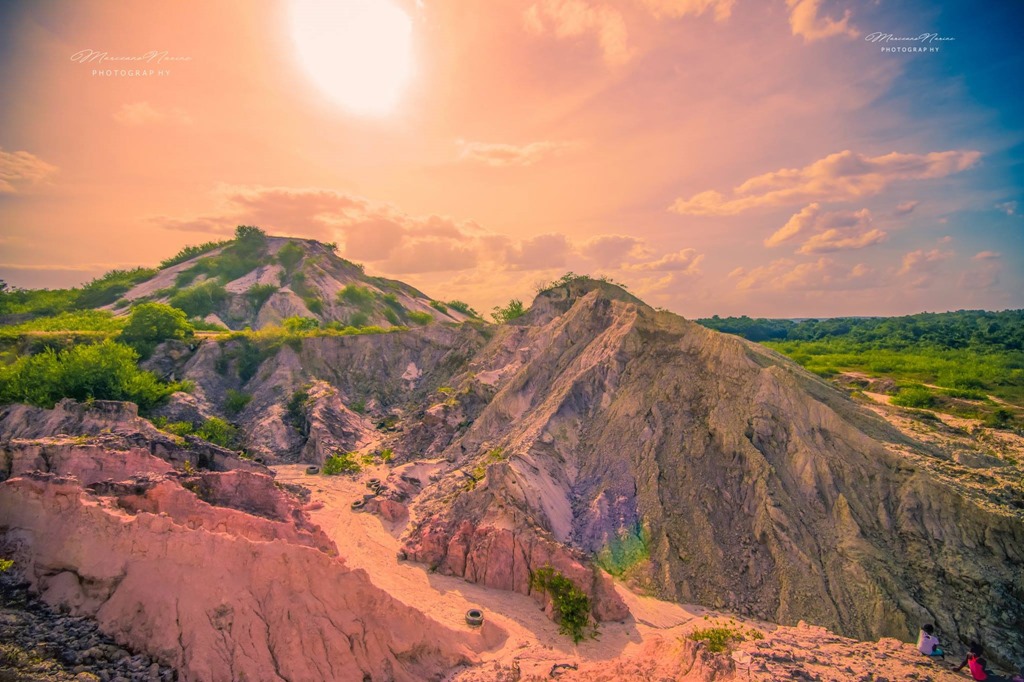
An adventure that started off as a disaster ended with natures astonishing beauty. Every adventure has its share of ups and downs but for Marceano and his brothers it captured something that he considers to be some of the most specular images of his career thus far.


29872409_1639407796108469_2463197110440155415_o


Day One of his adventure was a very rainy one with continuous rains into day two however, the skies cleared up in the wee hours of the dawn of dust (1:30 am), so they still ventured out to see what the new day would bring. Continue reading

Kaieteur National Park

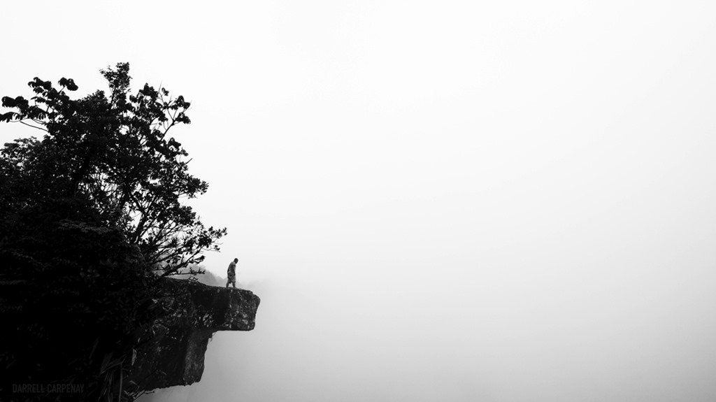
– An Experience In Photographs


THE EDGE_thumb

I’ve found that the images photographers create are more a reflection of their character and mood. Once we hone our skills, what we create is more about who we are and what we feel at that moment than the technology in our hands. Our art becomes a projection of ourselves. Continue reading

GVACE 2017 – Making the cut

2017 - post - making the cut


If the judging goes as per normal (and by normal, I mean, what generally happens in competitions of this sort), here’s a few thoughts on what to expect.

Since the re-invigoration of the Visual Arts competition after too long a hiatus, a few categories were added, including Photography; because of the relative ease of access to photographic capture devices, it was no surprise that the number of entries was large as compared to other traditional Visual Art categories like painting, drawing and sculpture.

In 2012, 52 entries were recorded and in 2014, 86 entries were recorded (as far as I can ascertain from media records available).

To begin with, all qualifying entries are viewed collectively and a pre-judging session is expected to take place, weeding out what may be obvious non-contenders, those that just don’t impress the judges in any way.  After that, the remaining images, most times, between 75-95% of the original entries are then scrutinised and judged individually by each judge in the panel.  It has been known for the process to proceed with the field narrowing in groups, until a Finalist shortlist is reached, from this shortlist, the final winners of the Gold, Silver and Bronze medals are selected.

For me, there are three basic stages of making the cut…  To make it past the pre-judging phase usually means your work is good enough to reach the Exhibition phase, this in itself is an accomplishment, you get to be on Exhibition with your peers as well as being able to put into your list of accomplishments, being part of an Exhibition at the National Art Gallery, Castellani House.  The second stage of making the cut is to be Shortlisted, here you are considered a finalist; the last cut is, of course, being the recipient of one of those medals (and the accompanying cash prize).

Below, you can see a display of the shortlisted and medal winning photos from 2012 and 2014.

Shortlisters

Don’t try to find a pattern, there isn’t really one.  The judges change, and the dynamics change from event to event, the one commonality that I can easily point out in these images is their strong compositions.

In 2014 I had mentioned a few times that it was likely that the top three would be different, and it happened, I think it is a distinct possibility that we can see another set of names up there in the top three again this time around.

Choose your images wisely, forget what you “think” the judges may want to see, find one (or three) that you are passionate about, and use it.


13508856_10209814166049767_8850099048653375459_n

Michael C. Lam works in Graphic layout for a living, one of his images gained the Bronze medal in the 2012 GVACE, he was shortlisted for the 2014 GVACE, was an exhibiting artist in the Un | Fixed Homeland curated exhibition at Aljira, New Jersey in 2016, and an exhibiting artist at the 2016 VISIONS Curated Exhibition. Some of his work can be seen on his site The Michael Lam Collection


GVACE 2017 – Presentation

2017 - post - presentation


Let’s talk about the final look of your piece(s).

After printing and signing your photograph, it has to be prepared for presentation.  Its important to remember that this is a Visual Arts Competition AND Exhibition, your photograph is being entered as an art piece, and the presentation of the piece is important, not only for the judging by the official judges, but by those viewing it at exhibition, for those of us who may be lucky enough to make it to exhibition.

As photographers, we probably have more options than most other aspects of the Visual Arts in terms of our final presentation; the basic thing is that whatever you submit must be ready to hang on a wall, there should be nothing left for the curator to do.

Whether you want it matted and framed behind glass, or framed without the matte, or even without the glass; or if you want it mounted on foam board, frameless with a mounting hook at the back; or sandwiched between two sheets of glass with polished studs in the corners; or mounted on a piece of plywood; it is an artistic decision in itself.

Whatever you decide, it should complement the photo and not detract from it; or you can choose one to be so innocuous that no one notices it.

For example, it is unlikely that a black and white portrait would look good in a red frame, so don’t do it; a fancy frame may work with an abstract image, but may or may not look garish on a landscape; and you probably wouldn’t want a four inch thick frame around a very small photo… these are not rules, you have to decide what may work best. Look around, see what frames or mounting options may appeal to your piece, ask opinions.

When all is said and done, you are presenting a finished piece to be judged and displayed, make it worthy of your name.

Let’s make this GVACE one to remember.


13508856_10209814166049767_8850099048653375459_n

Michael C. Lam works in Graphic layout for a living, one of his images gained the Bronze medal in the 2012 GVACE, he was shortlisted for the 2014 GVACE, was an exhibiting artist in the Un | Fixed Homeland curated exhibition at Aljira, New Jersey in 2016, and an exhibiting artist at the 2016 VISIONS Curated Exhibition. Some of his work can be seen on his site The Michael Lam Collection


GVACE 2017 – Sign & Date

2017 - post - sign and date


This will be almost verbatim from my 2014 post…

Now that you’ve printed your photograph, prior to, or even after, mounting and framing your piece, you should sign and date it.

DO NOT print an intrusive watermark or logo onto the photograph. While such things are common when distributing your prints or publishing them online, it is not a part of your photo and should not be included in a “work of art”, and make no mistake, you are submitting a work of art to this competition.

Once you sign the piece, you consider it finished and ready for public viewing.

Recto or Verso
There are two surfaces usually available to sign, the front (Recto) or the back (Verso). Traditionally most artists use Recto Signatures. This lends to easy identification of the artist. Verso Signatures are often used by artists who think that their pieces are easily identifiable and need not intrude upon the image with a signature.  It is important to note that in the 2014 editing of the competition, the chief judge had mentioned a preference for Verso Signatures, this was not mentioned in 2012 but it is food for thought.

Because this competition is time sensitive, the date of the piece is important. In the traditional arts it may well take many years to complete a piece, and that completion date is what is important. In Photography this process usually tends to be faster. The date I put on the recto surface under my signature is usually the date (month) it was printed, but I have sometimes used the Capture date when it seemed to me that that date was important.

As photography goes, here is my suggestion:
Use only photographs taken within the stipulated time period, this may be queried with the secretariat, but I think this is the safest way to approach it.  Sign and Date your piece, whether you use a Recto Signature or Verso Signature, it doesn’t matter.  On the Verso side, affix something, a card, a sticker, that may contain such details as you would like to be known about the photo; I suggest the following basic information (for your own purpose as well as for anyone looking to purchase the piece):

Photographer’s Name:
Capture Date:
Date Completed:
About the photo:

When talking about the photo, remember that you are trying to express something through your art, this should complement or augment the photograph.

Optionally, you may also include such things as location (GPS co-ordinates, village name, country, etc) as well as technical information such as the EXIF information

Every piece is unique, show us what you have to offer 🙂


13508856_10209814166049767_8850099048653375459_n

Michael C. Lam works in Graphic layout for a living, one of his images gained the Bronze medal in the 2012 GVACE, he was shortlisted for the 2014 GVACE, was an exhibiting artist in the Un | Fixed Homeland curated exhibition at Aljira, New Jersey in 2016, and an exhibiting artist at the 2016 VISIONS Curated Exhibition. Some of his work can be seen on his site The Michael Lam Collection


GVACE 2017 – Printing

2017 - post - printing


At this point, we’re assuming you have already taken the camera out, shot the photograph, downloaded it, and processed it to your liking, it might be in full colour or black and white, and, given that we are not confined to any of the photography sub-genres, your images may be anything from landscapes to portraits, street photography to studio work covering any and all subjects.  It’s time to print your entries.

The GVACE does not accept digital files as your submitted artwork, you have to print it out (and have it ready to hang).  I seem to recall the brochures for the 2012 and 2014 editions of the competition having a minimum size requirement, but it is absent from this year’s brochure except it advises that the size you chose should be practical for viewing, mounting and displaying the work.

In considering the size at which to print your pieces, there are a few things to consider, I shall touch on three of those although there are likely many more.

Original Image Quality – If you shoot film, the negatives, the enlarging equipment or scanner quality will play parts in this, if you shoot digital then it will be the original size of the JPG or RAW image that your camera shot.  Tablets, cellphones and other mobile devices as well as many point-and-shoot cameras have small sensors and therefore have some of the lower quality images, but many modern devices have quite capable cameras and many of those images can be printed relatively large.  Your DSLR or Mirrorless cameras will likely not have an issue (unless, of course, you set it to only record small JPGs, then you only have yourself to blame).

Know your software, and at least understand the resolution of your images when scaled to various sizes in the software.  While you can possibly get away with using 72dpi screen resolution images, it’s definitely not advisable, your image should be around 240dpi or higher at the required size when printing.  If an image is printed at too low a resolution, it will pixellate and the degradation in image quality will be obvious, and likely result in a very poor print.  If it cannot print large, don’t force it, use a small print, a good quality small print will be better than a bad quality large one.

Determined by the Image – What size would the image be more presentable at when hung on a wall?  sometimes a portrait may be perfect as an 8”x 10” print, or it may look better when larger, but not because the original image quality allows you to print the image two metres high means that you should.  A nice high-key portrait would probably look good as a small print, and a photo that relies on texture for its composition would be more effective printed large.  Pay attention to the elements in your composition, is there something that requires to be seen large, or are there elements better left small, hidden from prying eyes?

The Lab, the Printer, the Frame – Where do you intend to print the images?  Some people may opt for printing abroad, to have it professionally printed in the USA, by places like Adorama, BayPhoto, FineArtAmerica or a number of other options, probably a good idea, as they’ll also be able to offer you a wide variety of substrates, from high gloss, to matte, or wooden surfaces, to metallic surfaces, maybe even glass… just consider the visual impact and how it affects the photo, is it gimmicky? or does it enhance the photo?  There are some local labs / photo centres that you can use, fewer options of media, but even the difference between glossy and matte makes a difference.   Also you may even consider printing it yourself, that is always an option. 🙂  Whichever method, make sure that you’re complimenting the photo with the printing and not detracting from the image itself.   You also have to consider that you may not be able to get your print custom framed, so the frame may be your limitation, find the appropriate frame and print to fit it, it may mean cropping to suit, which may alter the composition, be wary of that, although a different composition may still be better than a photo floating in a frame.


13508856_10209814166049767_8850099048653375459_n

Michael C. Lam works in Graphic layout for a living, one of his images gained the Bronze medal in the 2012 GVACE, he was shortlisted for the 2014 GVACE, was an exhibiting artist in the Un | Fixed Homeland curated exhibition at Aljira, New Jersey in 2016, and an exhibiting artist at the 2016 VISIONS Curated Exhibition. Some of his work can be seen on his site The Michael Lam Collection


GVACE 2017 – Post-Processing

2017 - post - Post-Processing


Post-Processing refers to everything that is done to an image after it is captured.  Some people like to say that they don’t do any post-processing or editing to their images, if you shoot RAW, then its possible you are right, if you do nothing with that RAW image other than print it directly.  If you shoot JPEGs as the native format in your camera, then it is likely that some amount of automatic post-processing is already done in-camera, usually some small adjustments to things like contrast, brightness and saturation.  The point being, pretty much all photographs are post-processed.

Whether you adjust the resulting image to more closely resemble what you think you remember the scene being like, or to have a more artistically expressive image, post processing can entail anything from simple processing like adjusting brightness, contrast, saturation, etc, to full image editing like illustration and manipulation, adding elements, removing elements, layering, multiple image usage in the same frame, almost anything imaginable.

It doesn’t matter what you use; PhotoShop, AfterShot, Aperture, CaptureOne, GIMP, Lightroom, DarkTable, LightZone or any other software, expressing yourself, your intent through the final piece is what’s important.

From experiences in the past, here are my suggestions, although I in no way suggest that this is what should be followed, we simply have no idea what the judges are looking for, but these are my thoughts:

Keep it simple; although they are looking at it as Art, they are still conscious that they are looking at Photographs.

Colour vs BW; be careful with monochrome images, while many of the previous finalists and short-listers have been monochrome images, the strength of the composition is what would make a difference.  Use colour to help tell the story, not be part of the clutter, changing images to monochrome (black and white) removes that part of the storytelling and leaves the content and composition as the only remaining tools, if those are weak, then the image will falter.

HDR;  High Dynamic Range images are powerful when done right, try for subtle over cartoonish, but remember the story that the image is telling and don’t let the processing over-power it.

Megapixels & RAW vs JPEG; the lower the megapixels, the less detail the software has to deal with, also RAW files tend to have lots more detail than JPEGs to work with, adjustments in the software should be done carefully, too much push or pull on the sliders can lend to some garrish results, even showing up the grain and pixels more, thread lightly, but still try to achieve the look you wish.

Screen vs PRINT; some software can simulate a preview of what the print may look like, its important to know that all the colours that can be reproduced on screen cannot be reproduced in print, the colour gamut of your screen and many software are much wider than the colour gamut of the printers, keep that in mind when processing, colours out of the range can lead to less than pleasing printed results.

Processing and Editing; One of the the sentences that identifies the Photography category for GVACE is “Digitally manipulated photographs must be so identified”.  This sentence leaves me wondering sometimes, as to how much I should mention about digital manipulation of my photograph, especially as they all have to be digitally manipulated to some extent.   I use my own definition of Processing and Editing when detailing this portion on the form.   I “Process” most of my images, so I usually mention that I’ve used basic post-processing techniques such as brightness, contrast and saturation adjustments, if I converted to black and white, I mention that too, I may even mention what software was used in the processing.  What I think the sentence definitely covers is ”Editing”, that is the addition or removal of things in the image, whether its as little as cloning out garbage, or the addition of extra flower petals, the wiping out of power lines, or the the use of multiple exposures for effect, these should be mentioned, explicitly.  Also, as simple as it sounds, if the original photograph was cropped, then that too should be mentioned.  It sounds like a long list if you actually consider the amount of post-processing that can go into a photograph, but its better to be safe.

In the end, don’t let the details bother you too much, just choose an image you love, process it the way you want, and go for it.

13508856_10209814166049767_8850099048653375459_n

Michael C. Lam works in Graphic layout for a living, one of his images gained the Bronze medal in the 2012 GVACE, he was shortlisted for the 2014 GVACE, was an exhibiting artist in the Un | Fixed Homeland curated exhibition at Aljira, New Jersey in 2016, and an exhibiting artist at the 2016 VISIONS Curated Exhibition. Some of his work can be seen on his site The Michael Lam Collection

GVACE 2017 – The Camera

2017 - post - The Camera


It’s important to remember that this is not a photography competition, but an Art Competition, but with Photography being a category, the judges are not photographers (not likely, anyway), they will not care about the camera used, nor the details of digital vs film, or the amount of megapixels, they are only concerned with what is presented to them visually.

Today, it is almost inevitable that we have some sort of device on us that can capture an image; whether you still shoot film, have an early digital camera (which probably never amounted to a megapixel), own the latest DSLR, a mirrorless camera, a point-and-shoot, a tablet or a phone, or, for that matter, Snapchat Spectacles or Google Glass, the device is less important that the image produced.  You can use any capture device for photography, its what you do with it that matters.

Know your camera, know its limitations, and work within them to effectively convey what it is you wish to express.  I’ve been doing an Instagram project myself over the last two years, much to my own delight, and there is something liberating about using a cellphone to capture, process and share an image.  The thing to remember about all the varieties of capture devices is not only the technical limitations of capturing, but the final size limitation of the image to be printed.  I often print my Instagram images at about 5 inches square, although I have also printed some at 15 inches square.

Size Matters.  I’ll discuss this a bit more when I touch on Printing in a later post, but in this instance I want to stress the limitations of the camera.  Megapixels might not matter to the judge, but it should to you, the photographer, smaller devices (and older devices) such as point-and-shoot cameras, cell-phones and tablets, generally have lower mega-pixels, but what they also have are smaller sensor sizes, which also affects the quality of the photo; read up on your device’s properties a bit, just to be familiar, but remember that not because you want a photo to be impressive that you have to print it large;  Printing larger than the image should go will only reveal in the final print the limitations of the original image, and you may end up with pixellation of the images and loss of sharpness.

In the past it has been the habit of photographers to print their pieces as large as they could, but I can tell you that one of the pieces I remember vividly from 2012 was a small print by Jamila Huntley, a very good image, and the photographer either knew the limitations or happened to print it at just about the right size, for even at that size, I could see that printing larger would have been a mistake.

Some images are meant to be printed large, others to be small; even images taken with a high resolution camera don;t have to be printed to the largest possible size, the effectiveness of an image is not simply size, it is in its content and composition, keep those in mind first, and the limitations of the image size second, this will be important when deciding to print.


13508856_10209814166049767_8850099048653375459_n

Michael C. Lam works in Graphic layout for a living, one of his images gained the Bronze medal in the 2012 GVACE, he was shortlisted for the 2014 GVACE, was an exhibiting artist in the Un | Fixed Homeland curated exhibition at Aljira, New Jersey in 2016, and an exhibiting artist at the 2016 VISIONS Curated Exhibition. Some of his work can be seen on his site The Michael Lam Collection