GVACE 2017 – Portraits, Flowers, Animals, etc.

2017 - post - portraits


Firstly, some disclaimers; I am not a judge, the content of these posts are my views based on experience, and for this post in particular, I do not take many of these types of photos.

Now, a reminder that this is an Art competition, not a photography competition, so the judges are likely looking at your entries as pieces of art, rather than a photograph, and they won’t care about the sub-genres such as landscapes, portraits, street, macro, etc.  Also, their knowledge of photography may not be in-depth, so they could probably care less about your HDR technique, the macro-lens you used, or the amount of work (or lack of) that you did in Photoshop.

In deciding to use a photograph of things like people (portraiture specifically), flowers, animals, sunsets, buildings, your shoe or your big toe, remember that it has to appeal on an artistic level.   While the portrait you did of a pretty girl may look very appealing, unless it is outstanding it likely won’t appeal as a work of art, think of Steve McCurry’s Afghan Girl, you might hang that on your wall, but the portrait of a bride you might not, unless of course, you probably know her.  Flowers and sunsets are pretty, but they are a dime a dozen, and unless it has a visual appeal that sets it apart from all the other photos of sunsets and flowers it won’t stand out, for sunsets (or sunrises for that matter) make sure you have foreground interest or a subject that compliments the overall scene as well; for flowers, macro photography or including it as part of a landscape is likely to be more appealing than just a focused image of a single flower.   I’m not saying that a simple sunset or even a single flower cannot be artistically appealing, I’m saying that its harder, but entirely possible.  Animals in a photo can often be appealing, but that’s usually when they are part of the scene rather than the entirety of the image, again, it is quite possible for an animal portrait to be appealing, but its harder, also, just having a single animal dead centre of the frame (the same goes for flowers or any other subject for that matter) is often the least appealing of compositions.

I am not trying to dissuade anyone, remember I don’t often do these types of photos myself, but going on the types of photos that made the shortlist in the photography category in the last two editions of the GVACE, it seems harder for these types to cross that threshold, but not impossible, a portrait by Jamila Huntley did make the short-list in 2012, Sharon (Paul) Ramkarran’s Silver medal winning image had birds in the composition in that same year, 2014’s Gold medal winner by Fidal Bassier can be considered a street photograph, street portrait or a candid photo; but each of those had some context that set them aside from others of its kind.

If these are the kinds of photographs that you like taking, its quite likely that you have one that stands out, one that could be a winner.


13508856_10209814166049767_8850099048653375459_n

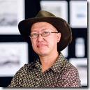
Michael C. Lam works in Graphic layout for a living, one of his images gained the Bronze medal in the 2012 GVACE, he was shortlisted for the 2014 GVACE, was an exhibiting artist in the Un | Fixed Homeland curated exhibition at Aljira, New Jersey in 2016, and an exhibiting artist at the 2016 VISIONS Curated Exhibition. Some of his work can be seen on his site The Michael Lam Collection


GVACE 2017 – Post-Processing

2017 - post - Post-Processing


Post-Processing refers to everything that is done to an image after it is captured.  Some people like to say that they don’t do any post-processing or editing to their images, if you shoot RAW, then its possible you are right, if you do nothing with that RAW image other than print it directly.  If you shoot JPEGs as the native format in your camera, then it is likely that some amount of automatic post-processing is already done in-camera, usually some small adjustments to things like contrast, brightness and saturation.  The point being, pretty much all photographs are post-processed.

Whether you adjust the resulting image to more closely resemble what you think you remember the scene being like, or to have a more artistically expressive image, post processing can entail anything from simple processing like adjusting brightness, contrast, saturation, etc, to full image editing like illustration and manipulation, adding elements, removing elements, layering, multiple image usage in the same frame, almost anything imaginable.

It doesn’t matter what you use; PhotoShop, AfterShot, Aperture, CaptureOne, GIMP, Lightroom, DarkTable, LightZone or any other software, expressing yourself, your intent through the final piece is what’s important.

From experiences in the past, here are my suggestions, although I in no way suggest that this is what should be followed, we simply have no idea what the judges are looking for, but these are my thoughts:

Keep it simple; although they are looking at it as Art, they are still conscious that they are looking at Photographs.

Colour vs BW; be careful with monochrome images, while many of the previous finalists and short-listers have been monochrome images, the strength of the composition is what would make a difference.  Use colour to help tell the story, not be part of the clutter, changing images to monochrome (black and white) removes that part of the storytelling and leaves the content and composition as the only remaining tools, if those are weak, then the image will falter.

HDR;  High Dynamic Range images are powerful when done right, try for subtle over cartoonish, but remember the story that the image is telling and don’t let the processing over-power it.

Megapixels & RAW vs JPEG; the lower the megapixels, the less detail the software has to deal with, also RAW files tend to have lots more detail than JPEGs to work with, adjustments in the software should be done carefully, too much push or pull on the sliders can lend to some garrish results, even showing up the grain and pixels more, thread lightly, but still try to achieve the look you wish.

Screen vs PRINT; some software can simulate a preview of what the print may look like, its important to know that all the colours that can be reproduced on screen cannot be reproduced in print, the colour gamut of your screen and many software are much wider than the colour gamut of the printers, keep that in mind when processing, colours out of the range can lead to less than pleasing printed results.

Processing and Editing; One of the the sentences that identifies the Photography category for GVACE is “Digitally manipulated photographs must be so identified”.  This sentence leaves me wondering sometimes, as to how much I should mention about digital manipulation of my photograph, especially as they all have to be digitally manipulated to some extent.   I use my own definition of Processing and Editing when detailing this portion on the form.   I “Process” most of my images, so I usually mention that I’ve used basic post-processing techniques such as brightness, contrast and saturation adjustments, if I converted to black and white, I mention that too, I may even mention what software was used in the processing.  What I think the sentence definitely covers is ”Editing”, that is the addition or removal of things in the image, whether its as little as cloning out garbage, or the addition of extra flower petals, the wiping out of power lines, or the the use of multiple exposures for effect, these should be mentioned, explicitly.  Also, as simple as it sounds, if the original photograph was cropped, then that too should be mentioned.  It sounds like a long list if you actually consider the amount of post-processing that can go into a photograph, but its better to be safe.

In the end, don’t let the details bother you too much, just choose an image you love, process it the way you want, and go for it.


13508856_10209814166049767_8850099048653375459_n

Michael C. Lam works in Graphic layout for a living, one of his images gained the Bronze medal in the 2012 GVACE, he was shortlisted for the 2014 GVACE, was an exhibiting artist in the Un | Fixed Homeland curated exhibition at Aljira, New Jersey in 2016, and an exhibiting artist at the 2016 VISIONS Curated Exhibition. Some of his work can be seen on his site The Michael Lam Collection

GVACE 2017 – The Camera

2017 - post - The Camera


It’s important to remember that this is not a photography competition, but an Art Competition, but with Photography being a category, the judges are not photographers (not likely, anyway), they will not care about the camera used, nor the details of digital vs film, or the amount of megapixels, they are only concerned with what is presented to them visually.

Today, it is almost inevitable that we have some sort of device on us that can capture an image; whether you still shoot film, have an early digital camera (which probably never amounted to a megapixel), own the latest DSLR, a mirrorless camera, a point-and-shoot, a tablet or a phone, or, for that matter, Snapchat Spectacles or Google Glass, the device is less important that the image produced.  You can use any capture device for photography, its what you do with it that matters.

Know your camera, know its limitations, and work within them to effectively convey what it is you wish to express.  I’ve been doing an Instagram project myself over the last two years, much to my own delight, and there is something liberating about using a cellphone to capture, process and share an image.  The thing to remember about all the varieties of capture devices is not only the technical limitations of capturing, but the final size limitation of the image to be printed.  I often print my Instagram images at about 5 inches square, although I have also printed some at 15 inches square.

Size Matters.  I’ll discuss this a bit more when I touch on Printing in a later post, but in this instance I want to stress the limitations of the camera.  Megapixels might not matter to the judge, but it should to you, the photographer, smaller devices (and older devices) such as point-and-shoot cameras, cell-phones and tablets, generally have lower mega-pixels, but what they also have are smaller sensor sizes, which also affects the quality of the photo; read up on your device’s properties a bit, just to be familiar, but remember that not because you want a photo to be impressive that you have to print it large;  Printing larger than the image should go will only reveal in the final print the limitations of the original image, and you may end up with pixellation of the images and loss of sharpness.

In the past it has been the habit of photographers to print their pieces as large as they could, but I can tell you that one of the pieces I remember vividly from 2012 was a small print by Jamila Huntley, a very good image, and the photographer either knew the limitations or happened to print it at just about the right size, for even at that size, I could see that printing larger would have been a mistake.

Some images are meant to be printed large, others to be small; even images taken with a high resolution camera don;t have to be printed to the largest possible size, the effectiveness of an image is not simply size, it is in its content and composition, keep those in mind first, and the limitations of the image size second, this will be important when deciding to print.


13508856_10209814166049767_8850099048653375459_n

Michael C. Lam works in Graphic layout for a living, one of his images gained the Bronze medal in the 2012 GVACE, he was shortlisted for the 2014 GVACE, was an exhibiting artist in the Un | Fixed Homeland curated exhibition at Aljira, New Jersey in 2016, and an exhibiting artist at the 2016 VISIONS Curated Exhibition. Some of his work can be seen on his site The Michael Lam Collection


GVACE 2017 – Composition

2017 - post - Composition


The subject of a photograph is usually the most compelling element that defines the image, but in a photograph with a weak composition, it can easily be overlooked for a photograph with a less appealing subject but which was better composed, in photography, as in all other art forms, composition matters.

No matter how interesting your subject, nor how creative you are with the use of colour, a weak composition can make a photograph unappealing.

There is usually a lot of talk about the rules in photography, but the truth is, there are no rules, at least not in how you compose the photograph, there are rules in certain types of photography, such as Journalism where truth is paramount, but as an artistic expression, the world is your muse and your digital or film camera is one of your tools, your canvas is the final medium onto which your print is done.

Now that we’ve established that there are no rules, let’s talk about the Guidelines to a good composition, and the tools you should be using and paying attention to.

This is not a tutorial, so I will only touch on a few things.

The Rule of Thirds

Yes, the first one is actually called a Rule, but don’t let the name fool you.  Once you’ve been in photography long enough, the rule of thirds is something that becomes second nature.  Basically you divide your viewfinder or screen into threes, three vertical columns, three horizontal rows, and you use the lines to place objects of interest, such as horizons, and the main subject.   It is almost instinctive to place the subject dead centre of the frame, this can be used to advantage in certain circumstances, but often as not it leads to a boring image, placing the subject off-centre, using one of the lines in the rule of thirds grid will add a better compositional element to the photograph.

Knowing this rule is also what helps to make even better compositions when you can successfully break the rule, sometimes using a very low horizon to add expanse to a scene, or placing the subject nearer to the edge of the frame to add a feeling of loneliness, or a minimalist feel.

Leading Lines

When we look at an image our eyes naturally follow lines in the image, whether they are the winding lines of a meandering creek, or a road snaking its way across a hilly landscape, or the converging lines of the sides of a bridge leading our eyes to a cyclist in the distance.   Using these lines in a composition to direct the attention to the subject is helpful, but be careful not to just pay attention to the lines and not the subject, lines leading away from the main subject can also weaken the main intent of the image.

Balance, Symmetry and Patterns

Sometimes, using the rule of thirds can leave a photo feeling unbalanced, a mailbox to the left with nothing to the right can feel like that, when there is an opportunity to use two elements to balance the image, it can help, even if, or especially, when the elements are not alike, like a tall tree on the right, and a small dog to the left.   On the other hand symmetrical images have a certain intrinsic appeal to the human brain, and using symmetrical scenes can add a strong compositional element to scenes, especially in architecture.   Similarly with patterns, like repeating clay-bricks or honeycombs in a beehive, the repetitiveness is appealing to the senses and helps to make a nice composition.  One nice trick with symmetrical images or patterns is to include in the composition something that breaks the symmetry or pattern, like a missing clay-brick in the wall, and the space may have a weed growing, or in front of the symmetrical building a person walks past to one side.

Perspective

Its normal for you to take a photo standing up, what’s known as “eye-level”, but that point of view is… well, its normal, and you might want to change that up periodically.  Go down low, or get up high, change the point of view and add interest to a scene.  Instead of from the front, see what the view is like from behind, or the side.  If you normally shoot subjects 10 feet away, change it up, get up close or take it from farther away.


There is much more to be discussed, but stick to the basics, let the strength of the photo come from the subject and the composition, and the rest is icing on the cake.

The best thing about Rules is knowing them so that you can break them effectively, breaking them and leaving the composition feeling off won’t help, but there are times when breaking them leads to a very strong image.


13508856_10209814166049767_8850099048653375459_n

Michael C. Lam works in Graphic layout for a living, one of his images gained the Bronze medal in the 2012 GVACE, he was shortlisted for the 2014 GVACE, was an exhibiting artist in the Un | Fixed Homeland curated exhibition at Aljira, New Jersey in 2016, and an exhibiting artist at the 2016 VISIONS Curated Exhibition. Some of his work can be seen on his site The Michael Lam Collection

GVACE 2017 – Choosing an Entry

2017 - post - choosing an entry


I think that taking the photos are easier than choosing ones to enter into competition.

In Photography competitions, there are usually themes, and categories, but in the Guyana Visual Arts Competition and Exhibition, Photography is part of the Visual Arts, and the entries are judged not simply as Photographs, but as Art.

There are no sub-categories like landscapes, portraits, street, etc., there is simply Photography, so the choice of image is yours.

What is your best, your most impressive?  And then, will it be likeable to the judges?

We can’t know what will be liked or not, but we can choose images geared in a certain direction.   I shall try to touch on a few aspects of the photograph itself in the next few posts, but for this one, its about the choice itself.  After two editions of the GVACE, a shot at VISIONS Exhibition, and six years of my own weekly project The Deck, I can tell you that choosing is hard, but I can also say it can be made easier.

Other than the other aspects which I will try to touch on in subsequent posts, the primary choice is very personal, the image has to be yours, as in, you have to be proud of the image; don’t try to choose things others “might” like, choose one that you like, when you are passionate about a subject it often shows in the resulting image.

Remember that the image represents you, it is an expression of your thoughts, emotions, your artistic sense.

Viewing them digitally is nice, but the true beauty of a photograph is often only revealed in print, one suggestion is to pick about two dozen of what you consider your best images in the last two years (or up to the date specified in the Rules) and print them out at one of those PhotoLabs around town, at standard 6” x 4”, lay them out on a table randomly and leave them there.   Leave the room, go do something else, let time pass, then return to the room, and look at the table from the doorway, or some distance from the table, and the ones that jump out at you, let those be the ones that make it to your shortlist.

Just over a year ago, when I was considering my own choices for the GVACE, I wrote a bit about it on my own blog, its there if you feel like giving it a read, along with some images, it ain’t easy, but in the end, the images you choose are your Choices!  You can read it here – Choices, Choices Choices.


13508856_10209814166049767_8850099048653375459_n

Michael C. Lam works in Graphic layout for a living, one of his images gained the Bronze medal in the 2012 GVACE, he was shortlisted for the 2014 GVACE, was an exhibiting artist in the Un | Fixed Homeland curated exhibition at Aljira, New Jersey in 2016, and an exhibiting artist at the 2016 VISIONS Curated Exhibition.


Shooting Weddings (in Guyana)

by Michael C. Lam


Let me start by saying that I am not a Wedding Photographer, and I would welcome and encourage any of the wedding photographers out there in Guyana to volunteer to write a follow-up article to clear up any misconceptions or erroneous assumptions that I may make.

What I want to convey is a (hopefully) short list of things that anyone undertaking to shoot a wedding in Guyana should take into consideration.  This is not a complete list, and probably misses lots of things that I haven’t encountered in my few weddings.  Also you should know that some of these things I am guilty of not having done (or have done), it is how we learn, and how we can help others.


Get to know the couple

I don’t mean everything about them, but it’s probably a good idea to meet with them, to discuss in general terms, what they like or dislike, what types of photos they want, whether throwing in a few whimsical ones or dramatic ones will work for them, and it can’t hurt to do a pre-wedding photo-shoot either, I’d say make it part of some of your Wedding Packages, since it gives you an idea of how they will react to the camera and to your directions, so when the big day comes there’ll be less surprises.

Type of Photography

Unlike many international photographers, few local wedding photographers have a Continue reading

Your Photos and Copyright

An Opinion piece by Michael C. Lam

Over the last few years I’ve learned some things about the images I produce through photography and the copyright laws that help to protect them, I am by no means a lawyer nor expert on this topic.  This article is based upon what I have learned through discussions, reading and research; the topics are touchy, they are complicated at times, and the simple explanations that I try to give in no way covers Copyright completely. Continue reading

People of Guyana

The original idea for this challenge was borrowed from an idea that Nikhil Ramkarran had for a long-term project of a similar title, his idea had more depth, but we were hesitant to add anything else to the challenge in fear that we would daunt some of the photographers.

Although a few sections of society are missing from the ensemble, the variety submitted was intriguing and entertaining, as much as it was enlightening and fulfilling in their photographic diversity.

The winning entry:

Brian Gomes’ “Amerindian Girl”

Brian Gomes Amerindian Girl


Continue reading

Yellow

Guyana Photographers’ Yellow Challenge (Challenge #16).  This challenge was not only well received by members, but the quality of images was good overall, and as one of the judges, I’ve decided to do a short review.


Ideally, there should be a review of the images in each challenge, at least of the finalists that are sent to the judges, but given that most of us are working stiffs, the ideal is seldom attainable. Given the amazing images that were entered into the Yellow challenge, I wanted to make some time for a brief review of this challenge.

We are not professionals, so the opinions expressed are merely that of peers and is based on our own experiences in photography and in judging photography.

I know that we may come under fire for some of the comments but we will make them nonetheless.  We begin with the winning photo…

Yellow - Khadija Benn - Bed of Daydreams