The original idea for this challenge was borrowed from an idea that Nikhil Ramkarran had for a long-term project of a similar title, his idea had more depth, but we were hesitant to add anything else to the challenge in fear that we would daunt some of the photographers.
Although a few sections of society are missing from the ensemble, the variety submitted was intriguing and entertaining, as much as it was enlightening and fulfilling in their photographic diversity.
The winning entry:
Brian Gomes’ “Amerindian Girl”
For anyone who has visited the hinterland areas of our great country, seeing everyone from young children to village elders making their way across the savannah and maintain terrain on bicycles is something to behold, especially when most of us coastlanders have a hard enough time walking around on the terrain.
This is a great photo… using a centrally placed subject works great for both posed and candid portraits,sometimes overused and sometimes too simple, but when done correctly it can be very impacting… she and the bicycle are perfectly placed, the receding mountain line the vanishing point toward the upper line of thirds and the low perspective on a fairly wide lens makes for an imposing image!
When the judges scores were combined this image placed second in the final three, in the final stage of the judging; when the final three images were ranked based on aesthetics, this edged out Nikhil Ramkarran’s “Lady in Red” for the winning image.
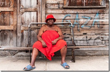
Second Place – Nikhil Ramkarran’s “Lady in Red”
Technically, this is an image that is impressive, so much so that the guest judge for the challenge, recent winner of the “Sky Challenge”, gave it a perfect score on all points. It has no last shadows, no blown highlights, great texture in the wood, lovely detail in the dress, and the folds in the dress could not have been better if they were posed. The graffiti laden walls puts you in “the hood” of “the ghetto”, it could be Albouystown or Trenchtown, but its Tiger Bay 🙂 A great image, but we expect nothing less from Nikhil.
Third Place – Ajay Baksh’s “Shy Girl”
There were four images that used the “cute” factor, this one clearly edged out the others 🙂 It is a good composition, divided into vertical thirds, good textural differences, the shadowy upper portion would normally annoy me, but instead helps to draw my attention to the main subject.
Ajay Baksh has consistently produced at least one in three images that have mass appeal, showing that he has an eye for a good image, and compositionally the photos are getting better, good job Ajay!
Rounding out the top five…
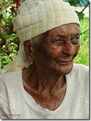
Nadja Ramsaroop’s “Chachee”
I love portraits like this, photos that show everything, they seem to almost delve beneath the surface and open the pages on the past. Great textural detail from the patterned top (blouse) to the wrinkled skin, nice use of a fairly shallow depth of field to pull her away from the background but still leave it easily identifiable. I wish the top of the head (headwear) was completely in the frame. Nice job Nadja!
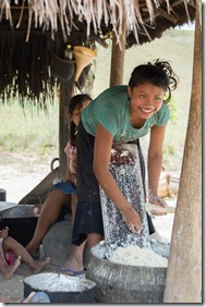
Sharon Paul’s – “Cassava bread made with a smile”
The main subject, flawless 🙂 That’s not just lips forming a smile, but the whole face lighting up. The angled column in the foreground, the dried leaves of the roof, the freshly grated cassava in the receptacles… all great elements… What I wish could have been different? (circumstances don’t permit these things, I know), I wish the face of the girl in the background wasn’t covered by the rear of the main subject… and I wish those two little legs weren’t sticking into the frame 🙂 A lovely shot Sharon!
Although I would love to comment on each of the other entries, time does not permit…I would like to mention two that should be noted, in the album on the Group’s Facebook page I urge you to look at the other entries, as they are all worth a second and third look, but I post for you here two that I think deserve notice
Kwesi Anthony Isles’ “One love”
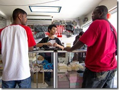
Fidal Bassier’s “Guyana”
I think I will let those two images speak for themselves!


Very good review Michael, well done to the entrants for some splendid images
Well done Michael.
Nice write up Mike, this was a great challenge and it is nice to know how the judges thought about the entries.