Critique of the finalists for “GP Challenge #18 – Night”
by Salim October
We begin with the Honourable Mentions.
Honourable Mention: The Moon by Marc Kersting
The Moon aptly captures one of the key element to our survival. There is no doubt that this is a night image at all as it shows the moon in one of its many phases. Its almost central location makes it unexciting to the viewer and, due to the fact that millions of images exist
which are similar in composition, the visual interest and storytelling elements are reduced.
On the other hand, the skimming nature of the light across the top offers a three dimensional look that was well captured and makes it almost seems like a sculpture.
There are a few changes I would recommend to strengthen this image. Firstly, I would place the moon in an extreme corner of the frame (rule of thirds) to increase visual appeal. Secondly, I would further increase visual appeal and the storytelling by using a bulb exposure to show some movement and bring out night sky details. Lastly it may have been useful to include some out of focus elements in the foreground to offer an added perspective.
All in all, it was a good capture of the moon. Congrats on being one of the finalists Marc Kersting.
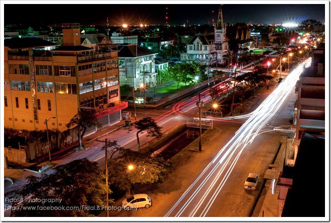
Honourable Mention: Avenue of the Republic by Fidal Bassier
Avenue of the Republic definitely depicts a night scene and therefore follows the night theme for this challenge. It draws the viewer instantly to the bold streaks of light defining the night scenery and makes them points of interest. The image is well balanced with the high rise cityscape to the left balancing nicely with the more action orientation defined by the busy streets below. The stationary cars offer a sense of scale to finalise the balance. Its myriad of colours cascading throughout, at various depths and heights, in the image offers a real perspective and tells the architectural story of the city since the light in-itself renders the outline of old English Georgetown. The clarity and focus highlight good camera techniques that have brought out infinite details that help tell this story. There is a great sense of three dimensionality through the creative play of lighting which is enhanced by the use of a slow shutter speed, careful processing and the creative selection of a vantage point. In addition, the use of the vanishing point was well executed.
If I were to offer an avenue for improvement of this image it would be to expand the cityscape scale by allowing for more sky to be included. In addition I would have used a polarizing filter to highlight more star shapes in the lights as well as cut through the glass in the windows for cleaner interior lighting.
Congrats Fidal Bassier for a very beautiful piece of night scenery in Guyana.
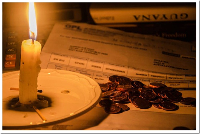
2nd Runner-up: Irony by Ajay Baksh
This image epitomises and embodies the theme perhaps in the most ironical manner; it truly is satirical when one takes into consideration the theme. Irony clearly draws a parallel between night and the response to the night without artificial light. The point of interest is somewhat lost in having the GPL bill way into the background but because the candle is so strong a subject is reorients the viewer to the realities of the subject. The presence of the coins enhances the message and the word “Guyana” in the image was a brilliant touch since it helps to set the context of the story. The use of the candle light as the main light really has helped to create the feeling of one being a part of the scene. This composition is well thought out and highlights a great degree of creativity.
If I were to recommend one key change it would be to shoot the image a bit wider, use fill lights on the coin and bill to enhance some details. The tip of the candle could have been made complete in the image so as not to give the feeling that something is missing. The focus could have been a little sharper, but it is not enough to detract, and the lighting could have been a tad brighter to bring out a little more details in the GPL bill and coins.
Well played with the Irony of the electricity woes in Guyana, Ajay Baksh. It truly was a beautiful concept.
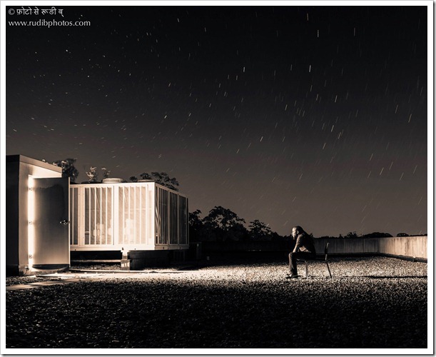
1st Runner-up: What Now? by Rudi B
Night is certainly evident in this image. The placement of the male figure in the lone chair offers a clear point of focus which has been enhanced by the curvatures of the star trails leading to the subject. The placement of the figure in the lower half of the frame offers a great sense of scale while the identifiable AC related apparatus on the roof provides lovely context. The image is sharp and highlights good camera technique. The long exposure has brought out all the necessary details, the chosen monochromatic/cross processing has worked in revealing greater details, contrast and texture. By exploiting the artificial light source a three dimensionality has been added to the image. The impeccable planning and selection of the location and the ultimate vantage point taken to execute the image was nothing short of being creative.
To perhaps make this image much stronger I would have added a rim light to the male figure to offer greater depth and separation. In addition I would have shot a bit wider and closer to the subject to strengthen the subject focus or alternatively include a wider perspective of the ‘room’ to include more industrial characteristics.
A much liked image by the members of the group, it really made them think “What Now?” Good creativity with this image, Rudi B.
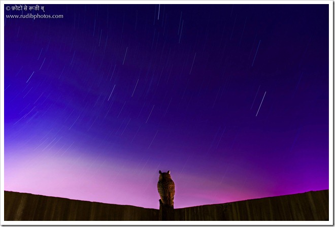
Winner: The Watcher by Rudi B
This image speaks volumes and certainly illustrates a night scene that is very much present but often unseen. The Watcher brings the viewer in sync with the life of the night and its serenity. The large arcs lead the viewer directly to the owl and illustrates how the sky is in tandem with other aspects of nature, its saturation is almost surreal. The “V” shape of the perch further draws the viewer into the image but one that highlights scale.
There was impeccable lighting achieved through a great degree of patience and the vantage point that was utilised to capture this image is illustrative of a creative process that was well executed.
I would offer the suggestion that perhaps the perch should have been placed a tad higher in the image so as not to create the feeling of disappearance.
This image is truly deserving of the win, Rudi B, well done!
All photos are copyrighted to their respected photographers and may not be used without their permission.
Salim October is a Guyanese born and Trinidad based Professional Photographer. He was asked to be a judge in this challenge to draw on his extensive experience working with light. He is the proprietor of Foto Melange in the twin island republic, and jumps at every excuse to visit his birthplace. We thank him for taking the time to give this review and critique .


Very nice summing up Salim. This was one of my favourite challenges so far. Creativity and skill on display.
I like when critiques are done as they help us to understand what the judges were thinking and gives us hints on how to develop our craft.
Thank you “_
Thank you for your review. All in all, this photograph (The Moon) was taken in 2009 with a telescope and an iPhone 3g 2MP camera. Do keep up the good work!
Enjoyed the read and appreciate the feedback. Good stuff…