Guyana Photographers’ Yellow Challenge (Challenge #16). This challenge was not only well received by members, but the quality of images was good overall, and as one of the judges, I’ve decided to do a short review.
Ideally, there should be a review of the images in each challenge, at least of the finalists that are sent to the judges, but given that most of us are working stiffs, the ideal is seldom attainable. Given the amazing images that were entered into the Yellow challenge, I wanted to make some time for a brief review of this challenge.
We are not professionals, so the opinions expressed are merely that of peers and is based on our own experiences in photography and in judging photography.
I know that we may come under fire for some of the comments but we will make them nonetheless. We begin with the winning photo…
First Place – Bed of Daydreams
Firstly, the bad news; of the seven criteria that the judges are asked to score, one is theme and this image actually scored lower than other finalists on this… The good news; it pretty much surpassed the other entries under the other criteria. Khadija Benn demonstrates how her creative conceptual photography can easily distinguish her work from the other amazing images submitted.
Everything worked for this image; the focus on the subject and more on the foreground than background, the colours are less subdued than understated. These helped to bring the viewer’s attention to the subject and main content – the girl and the yellow foliage. The square crop and the darker corners (possibly some vignette) draws you into the image and the glow from the sun in the upper right hand corner re-emphasizes that the girl in the grass is undoubtedly what you should be focusing on.
Almost perfection, Ms. Benn!
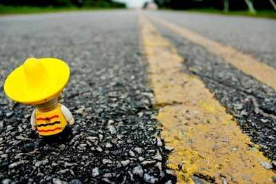
First Runner Up – Mr. Miyagi
With only 0.3 points separating it from the winner, we have Brian Gomes’ playful image unusually titled “Mr. Miyagi”
My first query to Brian would be “How does the name Mr. Miyagi play into what looks like a Mexican figure?” 🙂
The combination of a yellow clad figurine with the double yellow lines of the traffic markings emphasises the theme of the image; a shallow depth-of-field combined with a nicely placed vanishing point and the figure apparently staring towards the horizon draws the viewer into the story and makes you wonder what lies that way. The depth-of field, the contrasting materials of the figurine and the road give a nice play on textures; the focus and exposure work this to a good advantage but the bright sun and the smooth plastic of the figurine create an area on the “hat” that gives the appearance of a “blown-out” area where there may not be one.
Well done, Brian-san!
Second Runner Up – Focused
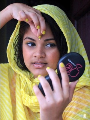
Rounding out the top three is TJ Reshi Rampersaud’s “Focused”, arguably her second-best entry into the challenge. Her other entry of note “Stroke of Sunshine” did not make it to the final cut.
When viewing this image on Facebook for the judging it kept showing up with a sliver of white to the left which was a bit distracting. Although the subject is centrally placed, compositionally it was fairly strong in spite of this. The yellow and white apparel, the yellow nail-polish and the yellow “bindi” (which came to be the “focus” of the image), all strengthened the theme of the image. The focused face and hand with the out-of-focus hand and compact gives the depth needed.
Two things I’d like to see different: a darker background with less detail, and a less obvious design on the compact; the pink in the compact drew my attention away too often.
A strong image with a good story to tell. Good job, TJ!
Finalists
When having images “voted” upon by all members, we see two types of images being included in the group of finalists. One type is the popular person (not necessarily a good image, but one whose owner has lots of friends voting); the second type is the popular image, one that is over-all a pleasing image, with some “pop” and general appeal. With the diversity and quality of images entered into this challenge, the popular vote can easily ignore the quality of the photography and promote pleasing images.
That being said, the quality of the finalists can easily be said to be higher than the average and deserving of praise.
In no particular order we review the other finalists…
Rubber Duckies by Amanda Richards
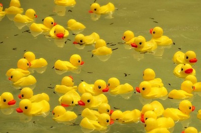 Of Amanda’s three entries, the one voted into the finalists was not her best entry. I think it pales besides her “Heart of Yellow Gold”. Rubber Duckies brings up images of bath tubs and “Bert and Ernie”. This playful image did not live up to expectations but was strong in its own right. Although the composition seemed off-putting with chopped off duckies and negative space in strange places, it had you following ducky to ducky to see what the next duck was doing. I think the aperture should have been wider or the crop different. Most of the image was in-focus, but the small parts that weren’t in focus tended to distract (top). Amanda continues to surprise me with the diversity of her subjects and willingness to experiment with her methods. Nice work.
Kiksadee Kiskadee, where are you? by Savita Balkaran
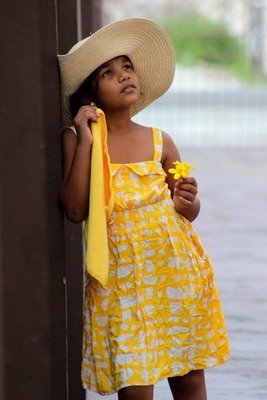
By far, this was aesthetically one of my favourites of the finalists; very vivid yellows that adorn and accompany the subject while having muted surrounding colours. I think the composition could have benefitted from off-centring the subject or even a tighter crop of the upper body. Overall a pleasing image. Nicely done, Savita.
Rudi B – Peela Phuul and Giant Yellow
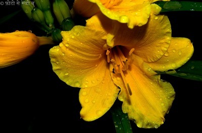
It says a lot for his photographic skill and impacting images that both entries from Rudi B made it to the finals. Although both were floral images, they were each distinct in style and setup. The high contrast, boldly colourful Giant Yellow with it’s water droplets though yellow in colour with very controlled lighting, sharply distinguishes itself from the light and airy Peela Phuul that uses natural sunshine for lighting. My one regret with the Peela Phuul image was that the flower that drew your attention at first was shadowed and your eyes quickly went to the brightly lit neighbour with the quaint curled petal. Rudi’s skill and patience always shows in his submissions. Great shots, Rudi!
An untitled image by Supriya Bera (Airy Room)
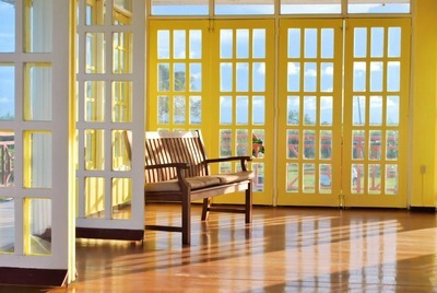
What this photo needed was a distraction, something to infer movement and life. It had nice geometry, good shadows, lovely ambient lighting, yellow doors accented by reverse sided white doors, streaming light through the doors with blue skies beyond, a chair and a broken window pane. Really, all it needed was a little child sitting on the edge of the chair staring at the broken pane 🙂 Nice work, Supriya!
The other entries into the challenge are worth looking at they truly made the choice of finalists difficult for viewers.

Alisa Ally – Flowers are autographs of angels, written everywhere The exposure and lighting on this was very nice, I’d suggest some closer attention to composition for a stronger image, I think that a crop of the current image can result in a difference between a 2-star image and a 4-star image here. Good work. |
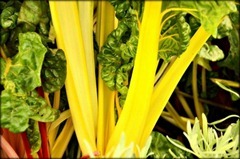
Amanda Richards – Eat yer vegetables
A close shot, very suggestive and, I think, very delightful. I think that maybe people’s aversion to eating their vegetable stopped them from voting this one in 🙂
Amanda Richards – Heart of Yellow Gold
The title had me searching for the “heart” shape (in vain), I loved this image, the lighting was excellent, the DoF was spot on I think.
Angela Singh – Yellow Express
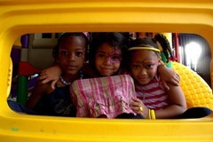
Creative and playful, I think some fill light on the children would have made this much more appealing
Asafo Jones – Yellow
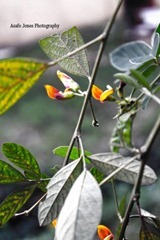
To me the sharpest thing in the image was a leaf beyond the colourful “blossoms”, and the lovey hues in the blossoms emphasise more to orange than yellow. I think a closer macro shot would have better utilized this particular subject.
Ayanna Waddell – Among the Rubble
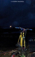
This appealed to me, it is fairly nicely composed (maybe a slight angle to the left may have helped), I think more rubble was needed to suit the title, I think the noise grain adds to the uniqueness.
Ayanna Waddell – mini MONSTER
My first thought on seeing this was “Lunch break”, both cyclist and machine operator off to have food 🙂 It’s a shame that both the main subjects were chopped a bit.
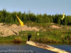
Ayanna Waddell – Perch
Lovely composition. This is one of those images where you think “If only…” If only that Kiskadee had faced this way then this could have been a contender!
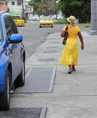
Dwayne Hackett – 3649
Loved the composition, the lady in yellow and the yellow car heading toward her were perfect, I actually wish the other yellow car wasn’t there, but the blue one provides a counterpoint to the image. Nice work.
Dwayne Hackett – 3793
I think this was a good street photo, that fit the theme well, my only concern was an angular dissymmetry that bothered me a bit about the composition.
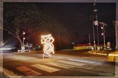
Francis Michael Bailey – Fire Starter
A pretty awesome photo, the golden glow of the fire-sticks, the ghostly yellow taxi, and the warm light from centre outwards works so well for it. I think the viewers idea of yellow tend more to the “lemon” version 🙂
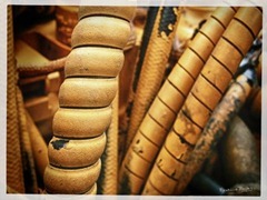
Francis Michael Bailey – Linear Yellow
Beautiful composition, splendid image, but again, the “yellow” that viewers have in mind failed to send this forward.
Hema T Singh – Untitled
A shame that this made it in late. Although the image has some severely blow out highlight areas, the composition was good and the image itself has the type of nostalgia that could have earned it votes. Nicely done.
Jason Yhap – New Stage
Warm lighting and a brand new subject makes for a very nice shot, what I actually liked were the “yellow” blossoms in the tree to the right. Nice work.
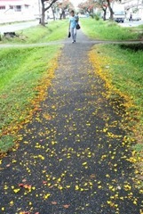
Kwesi Anthony Isles – Fallen
I like the colour and texture of this, I think I would have cropped out the entire top portion to concentrate interest on the asphalt and petals.
Nice job!
Kwesi Anthony Isles – Yellowed Path
I would not normally say this, but I think this is one of those photos that would Pop more with that selective saturation processing… you know? The one were it’s mostly a BW image with just the petals in Yellow standing out 🙂 Nice shot
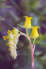
Nadja Ramsaroop – Echevaria
A beautiful photo, Great DoF, lovely colours well composed, One that should well have gotten more votes.
Nelsonia Persaud-Budhram – Newborn
A precious image that strikes a chord in every parent, I think that should the photo have been taken from another angle, it would have appealed to more voters. Nice work.
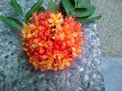
Nelsonia Persaud-Budhram – Yellow n Orange
The focus on this seemed to be off, more on the background than the flowers, and the colours were somewhat off the mark for the “Yellow” challenge, a good attempt.
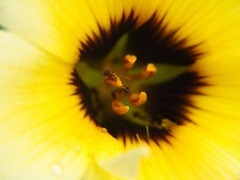
Nikita Blair – Ant’s World in a Vortex of Yellow
A stunning image, a very shallow DoF exaggerating the depth of the flower, and a very sharp focus on the ant. I would have cropped differently for effect… deserving of more votes.
Nikita Blair – Looking out and waiting
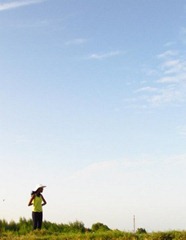
Simple and lovely, the yellow blouse is just enough to make its point, surely deserved more than one vote 🙂
Nikita Blair – Showing Off Yellow
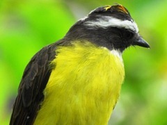
A sharp image that instantly grabs you, I think the saturation of the green in the background a bit distracting, but the majesty of the Kiskadee is undiminished, Kudos!
Ryan A Dos Santos – Untitled
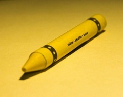
Who needs to title an image that is obviously Yellow? A yellow crayon on a yellow background with black markings; simple, effective and practically screams the theme 🙂 Nice work!
Ryan Andre Toney – Yellow Butterfly
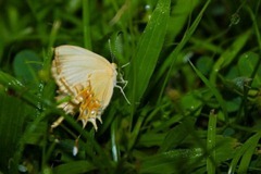
At first I thought, it’s not yellow, but then there are some unmistakable golden yellow highlights on the butterfly. Nice composition, great isolation, good job!
Sharon Paul – Its a yellow kinda day
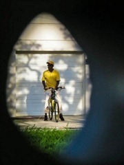
So, Facebook might have not been the ideal showcase for this… in this one the subtlety almost hits me like a sledgehammer… yellow-framed bicycle, yellow shirt, yellow cap and golden yellow warm afternoon sunshine. A good image that definitely deserved more votes.
Sharon Paul – Naughty Flower
With a title like that you just have to look! It’s sharp where it needs to be, good DoF, I’m not overly fond of the lighting, but it doesn’t spoil the image either. Good work
Sharon Paul – Up close and personal
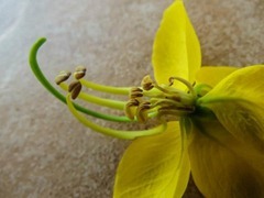
Gold and Yellow and shades in between, an excellent macro.
Shiva Dharry – Untitled
A good image, almost mouth-watering, has fair detail (could be more) and a very good composition! well done!
Stephen Asif Mohamed – Untitled
Warm lighting on a dark stage, all foreground images illuminated in yellow, a very nice image.
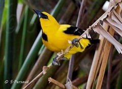
Stephen Persaud – Untitled
Sharp, well composed and a pleasing image, I really like how the bird is balanced between lush green vegetation and drying old leaves. Great shot.
Stephen Persaud – Roti Hut
I’ve grown accustomed to seeing Stephen’s photos, with care for the subject and detail, this one is not his usual style. I think the main flaw would be composition. nice try 🙂
Stephen Persaud – Yellow Butterflies
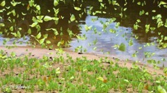
I love seeing these in flight, and this captures the slightly chaotic array nicely. It may be the white-balance, but they look more towards green than yellow on my screen. Good work.
TJ – Rising from the Shadows
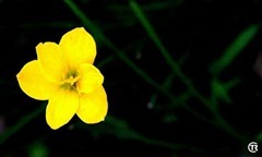
Were it not for the title, I’d have said the blossom looked disembodied, the lighting on the flower is very good, but I think the saturation level is too high resulting in lost detail in the petals. Good shot.
TJ – Stroke of Sunshine
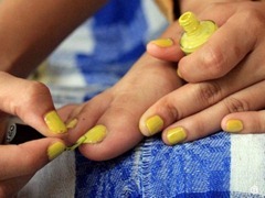
This photo probably epitomizes the Theme, bottle of yellow nail polish, nails adorned in it already and the brush applying more with a good contrasting background. This deserved more votes, a great shot for the challenge.
Vish Babulall – Untitled
Composed nicely, but I think the background is competing with the subject for dominance of yellow. Nice catch of the water droplets!
Vish Babulall – Yellow Halo
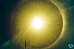
This might be called creative white balance 🙂 And we all know that the sun is yellow, right? A nice Parhelion.
Vitri Ann – Promise of Spring
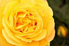
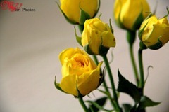
A lovely image, an almost centrally placed rose with progressively out-of-focus roses beyond. I think this one came in too late to garner the votes. Nice work.
The opinions expressed above are singularly from one judge and endorsed by the other two judges on the panel, they are not the opinions of all members of the group. The comments are meant as an understanding of how the images were perceived by (a) judge.
Michael C. Lam is a photo-hobbyist who works as a Computer Graphic Artist, although he favours landscape photography, as a hobbyist, his photos cover a wide gamut of styles and genres. The comments he made on this challenge are for an insight into his views on the submitted photos, not a professional review.









Great write up Mike. You really are an invaluable member.
Thanks Fidal
Well done sir. I tend to agree with most of your comments on the pics. Particularly on some of the images I believe were deserving of more votes.
Thanks Kwesi, it is instances where images that should have made the top and didn’t that I feel compelled to say a few words about it… but constructively 🙂 As I hope that my comments are taken in that spirit…
Thanks Mike. Indeed it wound be great to have insights on the the pictures entered for future challenges. )
Thanks Savita, but I’m not promising to do it every time… It’s a tough job…
Much appreciated thanks…^_^
You’re welcome. I hope the comments help and do not offend anyone.
Lovely points and thank you. I’m sure this would help us all in one way or another.
(Note: one typo under Dwayne’s ‘3649’ – “…counterpoint to THE….” 😀 didn’t pick up any more from the fast reading I did.)
thanks. fixed 🙂
Excellent review Mike. Well as it relates to naming my photo, Mr. Miyagi was the name of a character in the movie The Karate Kid. Its the first name that came to mind, and I just ran with it.
I must say I agree with most of your comments. Ms Benn’s photo was well done, although yellow isn’t the first thing that you think of when viewing it.
The entry by Supriya Bera was one of my favs, and I also think that it needed a main subject clad in some yellow and white clothing.
Looking forward for a review of the People in Guyana challenge when its done. 😉
Thanks Brian… I was wondering how the Karate Kid factored into it 🙂
We’ll try to encourage the judges on the “People of Guyana” challenge to do something similar 🙂
Great write up. Constructive and valuable critique that we can learn from and put to good use going forward.
Thanks Rudi!
Excellent reviewing. I like this because it gives a little insight into what needs work and how the judgements were done. Thanks for sharing!
Each judge in each challenge will see things differently, but having some feedback is better than none I hope 🙂
Oh it certainly is better than none!
This is the frosting on the cake of what must be the Group’s best challenge yet. Great job Mike.
Thanks Nik, with input from other judges and/or admins it could be better 🙂
Well articulated review Mike
Thanks Salim…
great comments…thanks. It would be useful if every challenge had feedback like this.
Thanks Nelsonia, if only life were perfect, each challenge would… 🙂
Great piece. Loved the feedback. Agreed on many of the comments. Looking forward to more feedback down the road, it was very informative and helpful.
Thanks… I hope it was… 🙂